What we will make
In this tutorial I’m going to show you how to take the design created for my
Fundamentals of Interface Design tutorial and turn that into a usable web interface.
What you will need
- Adobe Photoshop.
- The PSD File which can be downloaded below
- A pure text editor. I like Notepad++.
The Source
Download the PSD and HTML files
A Note about WYSIWYG Editors
I don’t use WYSIWG editors like Adobe Dreamweaver. Therefore don’t
be surprised if you find yourself doing a bit of coding. Don’t worry
though, it won’t hurt too much

Part One: Visualizing the CSS and HTML.
Before I begin anything I take an objective look at my interface.
What can I create using CSS/HTML? What do I need to slice? This saves me
time and often gets me the cleanest results.
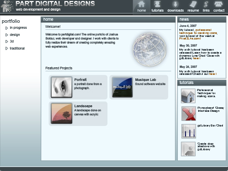
What sections do you see?
This is what I’m thinking to myself as I do this.
The following can be achieved with CSS
- The interface size and placement.
- The text and link colors, size, etc.
- The panel placement, size, border and background color.
- The borders on the icons.
- The Horizontel line between sections in the body.
The following will need to be sliced up.
- The header icons (including the active page icon).
- The header graphics, including logo and “Part Digital Designs” text.
- the header background color.
- The Background gradient.
- The gradient color of the panel headers.
- The footer.
- One of the navigation triangles.
Part Two: Slicing the interface.
I work simultaneously between slicing and CSS/HTML. This is fastest
method I’ve found when working on a personal project. However if you are
working in a group it’s best to keep each step separate.
Note: For the sake of this tutorial I’m going to
stick with Photoshop. However, if you have it, I highly recommend Adobe
Image Ready or Adobe Fireworks for slicing up your images.
Ok let’s get started.
Open the file that I’ve included for this tutorial.
Your First Slice
Press
K to select the slice tool and draw a box around the logo and title as shown.

Right click this slice and click
Edit Slice Options. Name it
header_title and click
OK.
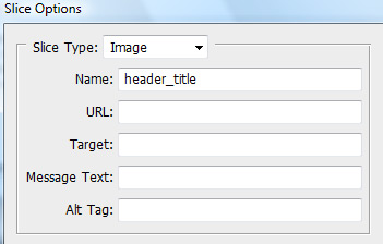
Remember these two steps as we slice up the interface because from now on I’m not going to be as detailed
in my explanations.
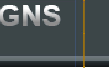
Create another slice near the one you just made that is
1 pixel wide and name it
header_bg. It should look like the image below.
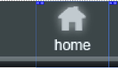
Create a slice around the home icon (including the selcted graphic) and name it
icon_home. Make sure it has a width of
60 pixels and a height of
54 pixels.
Repeat the process for the remaining icons.
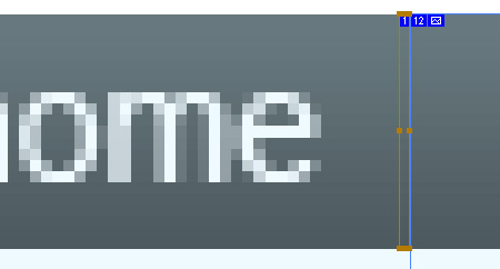
Create a slice at the home panel header that is
1 pixel wide and
19 pixels high. Name it
panel_bg
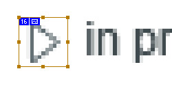
Create a slice around one of the triangles and name it
triangle-idle. Give it a width and height of
13 pixels.
Quick Tip: Hold down
Shift as you draw the slice and it will make a perfect square.
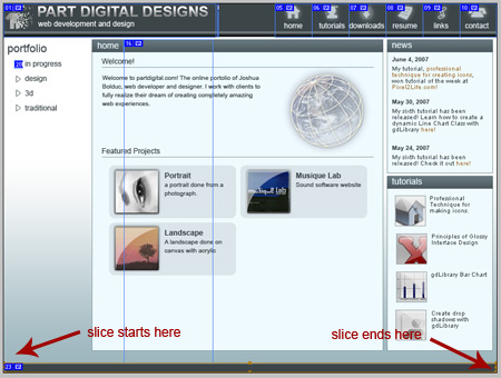
Create a slice around the entire footer and name it
footer
Go to
File > Save for web or devices.
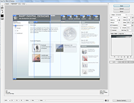
Click for a larger view
Make sure that the image type is set to
GIF
Click
Save and make sure your settings match these.

Click
Save
OK, we haven’t sliced up everything yet, but we have enough to get
started. So minimize Photoshop for now and open up your favorite pure
text editor.
Part Three: Setting the foundation.
Create two new files and name them
interface.htm and
stylesheet.css respectively.
Your project folder should look like this.
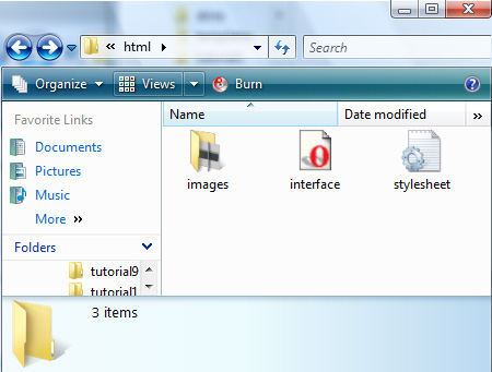
Note: Given the nature of operating systems, your icon graphics may not resemble mine.
Note: Creating web interfaces is a rather
complicated process, therefore I’m not going to go into every little
detail but rather highlight the most important aspects of html and css.
Copy the following code and paste it into your
interface.htm document.
05 | <title>My Interface</title> |
08 | <link rel="stylesheet" type="text/css" href = "stylesheet.css" media="screen" /> |
Now with this html code in, it’s time to think about how the layout is going to work.
Before you do any real CSS, think about the logic that you’re going to use. It’s best to have a picture in your
mind before you start rather than begin with little thought as it’s easy to work yourself into a corner.
helpful tip: When writing CSS, it’s best to start broad and then become more specific as you go along. (Just like painting a picture).
Copy and paste this code into your html document between the body tags.
09 | <div class="site-wrapper"> |
I can’t stress enough how important this first step is. It provides
the structure that the rest of your components will build on. You
wouldn’t trust a house with a shaky foundation would you? The same
applies here.
Copy and paste the following code into stylesheet.css
28 | border:solid 1px black; |
38 | background:url('images/header_bg.gif'); |
42 | background-repeat:repeat-x; |
69 | background:url(images/footer.gif); |
Note: In the early stages of production like this, I
highly recommend that you put a border on every block element (div,
table, h1, h2 etc. . ) that you create. It is much easier to visualize.
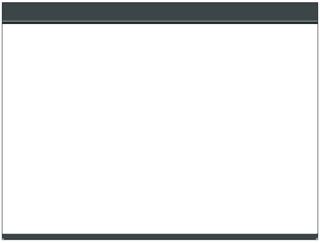
Open
interface.htm in your browser, it should look something like this.
Now that we have a good base, let’s build the header.
Part Four: Building the Header
Paste the following code into
interface.htm inside the
header-wrapper tags.
01 | <div class="header-title"><img src="images/header_title.gif" alt="" /></div> |
02 | <div class="header-menu"> |
06 | <li><img src="images/icon_home.gif" alt="home" /></li> |
07 | <li><img src="images/icon_tutorials.gif" alt="tutorials" /></li> |
08 | <li><img src="images/icon_downloads.gif" alt="downloads" /></li> |
09 | <li><img src="images/icon_resume.gif" alt="resume" /></li> |
10 | <li><img src="images/icon_links.gif" alt="links" /></li> |
11 | <li><img src="images/icon_contact.gif" alt="contact" /></li> |
Above I created a list of images. Normally lists are displayed as
vertical, bulleted entries but with a little CSS magic we can turn it
into a nice horizontel menu. Take a look at it now in the browser before
you go to the next step.
In
stylesheet.css, under
header-wrapper, copy and paste the following code.
The header menu should look like this.

Now let’s move on to the portfolio navigation.
Part Five: Building the portfolio menu.
Copy and paste the following HTML into interface.htm between the
body-wrapper div tags.
1 | <div class="portfolio-menu"> |
4 | <li><a>In Progress</a></li> |
7 | <li><a>Traditional</a></li> |
Believe it or not that’s all the html code you need to make the menu! Now let’s do some CSS.
Copy and paste this into
stylesheet.css
43 | background:url(images/triangle-idle.gif); |
44 | background-repeat:no-repeat; |
45 | background-position:center left; |
48 | border:solid thin black; |
54 | .portfolio-menu li:hover |
56 | background:url(images/triangle-active.gif); |
57 | background-repeat:no-repeat; |
58 | background-position:center left; |
Save the document and view it in the browser, the menu should look like this.
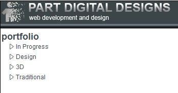
Ok now let’s build the center content area.
Part Six: Building the content area
Note: I’m not going to completely recreate the
content inside the panels because these sections are dynamic and they
would be populated at run time. Instead I’ll show you have to create the
panel make them ready to handle content.
Copy and paste the following into
interface.htm under
portfolio-menu make sure that it’s still between the
body-wrapper tags.
2 | <div class="content-wrapper"> |
6 | <div class="panel_title">home</div> |
Copy and paste the following into
stylesheet.css under
portfolio-menu
16 | border:solid 1px #869ca4; |
32 | background:url(images/panel_bg.gif); |
33 | background-repeat:repeat-x; |
34 | background-position:center center; |
Ok now let’s create the two right panels, you’ll find that this step is very easy.
Part Seven: Creating the right panels.
Copy and paste the following into
interface.htm right after the
content-wrapper div tag.
01 | <div class="right-wrapper"> |
03 | <div class="panel_title">news</div> |
04 | <div class="panel_content" style="height: 210px;">Your content for news goes here.</div> |
08 | <div class="panel_title">tutorials</div> |
09 | <div class="panel_content" style="min-height: 210px;">Your content for tutorials goes here.</div> |
Copy this into
stylesheet.css after
panel_title
Take a look at the interface in the browser. Congratulations! You
have all your menus and content areas ready for the world wide web!
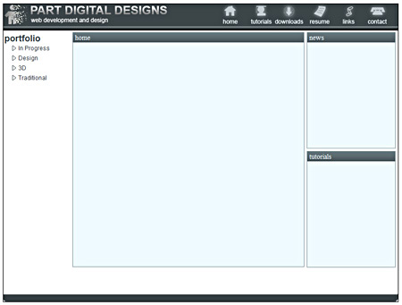
Click for a larger view
Conclusion
In this tutorial I’ve introduced you to some very useful and important concepts.
- Separating your layout from your styles.
- Using div tags to block out your layout.
- Using wrappers to hold your sections.
- Using lists to create menus


No comments:
Post a Comment